Saturday, February 28, 2009

Colored Pencil Landscape - Feb VSD

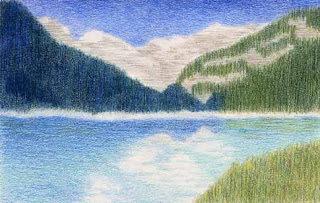
colored pencil drawing Lake Louise Canada
Lake Louise
6" x 4" colored pencil on matboard
Stacy L. Rowan

I wasn't sure if I was going to get to the Virtual Sketch Date this month. As it is, I am squeezing my entry in under the wire. This month's lovely reference was provided by Debbie Later. Thank you Debbie!

Two things caught my eye in this reference. First was the variety of beautiful blues. From turquoise to peacock to cerulean - it was a bonanza of blue.

The second thing I noticed was the play of vertical and horizontal lines. The trees on the mid-ground mountain provide the verticals and the striations on the background mountains along with the reflections in the water provide the horizontals.

I decided to simplify my drawing to basic shapes in order to focus attention on the colors and direction of the pencil marks. It was a different approach for me and I'm still trying to decide what I think of the end result.

Please remember to check out the VSD results post and the VSD Flickr group to see all the other entries.

Wednesday, February 11, 2009

Portrait Practice

Lately I have been feeling the need for speed.

Well, more truthfully, I have been wanting to improve my combination of drawing speed and accuracy. I believe I could draw anything I wanted given an infinite amount of time. And on the flip side, there is very little (if anything) that I could draw accurately in say 30 seconds.

So when I found out about a portrait group help by the Bethlehem Palette Club, I decided to give it a try. The group is for club members and is held every Wednesday morning during the colder months (January through April I think).

Each week we have a different model to draw. The models are all volunteers, but I have to say that so far each one has done a fantastic job. It is surprisingly difficult to sit without moving for 20 minutes at a time!!

Prior to joining this group, I had drawn or painted a grand total of 2 portraits. The first one was of my Grandfather. It was a gift for my mom. I drew it in graphite using an old photograph as my reference. I was pleased with the outcome, but it definitely fell in the "I can draw anything given an infinite amount of time" category.

My second ever portrait I did in watercolor at a workshop. I worked on it for a full day and added some finishing touches the next day. You can read about the experience and see the finished portrait here.

The first week of the portrait group I decided to use watercolors since I had had success with the watercolor portrait last year. Unfortunately, I didn't have a hair dryer with me, and I only had about two hours of total painting time. This made the portrait significantly more challenging and it shows in the results, which is exactly why I won't be sharing that portrait here.

Since there really isn't a good place to set up a hair dryer, I decided to try charcoal on colored ground for week two. The good news is that I felt the portrait was an improvement over week one. The bad news is that I was working on Mi-Teintes paper for the first time and I forgot that one side had a pretty pronounced textural pattern. Guess which side I drew on.

Also, earlier in the week I had been working on a graphite drawing. I don't typically use any blending tools when I work in graphite, but I do like to blend with charcoal. Of course, I forgot I liked to blend charcoal until about two thirds of the way through that session. Needless to say, I'm not sharing that portrait either.

But this week, this week I was prepared. I made sure to use the smoother side of the paper. I blended early and often. And I listened to my iPod to distract that inner critic. And the result... a definite improvement - not a masterpiece by any means, but something I am willing to share.


9" x 11"charcoal portrait on colored paper

Working from a live model under a time constraint is a great way to sharpen my skill at getting the pertinent information down in a timely fashion. My goal for joining this group is not to become a great portrait artist, but to see improvement in my portraits over the course of a few months. I am thrilled that I have already seen improvement in three weeks, and I hope I continue to improve from here.

Thursday, February 5, 2009

Music and Motivation

2" x 3" graphite sketch

I have a new studio tool to share with you today. (Well, it's new to me anyway.) I enjoy listening to music while I draw or paint. I find that it helps occupy my mind enough that it keeps my inner critic quite. This is particularly important in the early stages of a new work.

Although I like listening to music, listening to the radio bugs me. A lot of radio stations pride themselves on variety. Variety is another way of saying they try to please everyone. Which to me translates as I may like one song out of ten, but the other nine are meant to appeal to people with different musical tastes. Frustration from outside forces rarely helps the creative process!

An acquaintance mentioned that she liked listening to Pandora, so I checked it out. The premise behind Pandora is that you can create your own radio station. Click the "Create a New Station" button, type in an artist or band whose music you like and they will play that artist's music along with similar music by other artists.

If you want a station which plays more than one type of music, click on the station label and choose "Add Variety" which will allow you to input names of other artists you like. If they play a song you don't like, click on the thumbs down button at the bottom of the song box.

The result...a completely customized radio station playing only music you like. I've only used it twice, but so far it seems pretty cool!

And now for the motivation...

Christine Kane wrote this post about the impact of the economy. I really like her way of thinking.

Wednesday, February 4, 2009

House Portrait - Finished Painting

In my last post I showed you some preliminary work that I did for a house portrait commission. Below is the finished painting.

watercolor house portrait painting
9.5" x 13.5" watercolor on paper
Stacy L. Rowan

There are several things that I decided to change after completing the color study.

First of all I noticed that I "shrunk" the garage door when I went from the shadow guide to the color study. So I made sure in my line drawing for the final that it read as a two car garage.

I also decided to make some changes to the roof. The angles on the hip roof were one of the most challenging parts of this drawing. While I was enlarging the garage, I decided the roof angles still needed a little tweaking. I also choose to change the roof color making it cooler and lighter in value.

The last change involved the trees behind the house. In the final painting I used more cerulean blue in the large pines to push them further into the background. I felt this helped establish more depth in the painting.

Overall I found that creating the shadow reference and color study were very helpful, especially for this challenging project. I was much more confident when I got to the larger painting because I was familiar with the subject and knew I had already solved some potential problems.